What's New

Architect Featured in Regional Exhibit

Local Architect and entrepreneur, Diana M.H. Brenner FAIA, President of Brenner Design Incorporated is featured in the AIA Ohio Valley Region exhibit on the Achievements of Women in Architecture.  The Exhibit is open to the public October 22-November 30, 2015 at the Center of Architecture and Design in Columbus, Ohio.

The exhibit is a visual documentation that provides a current snapshot of the changing role of women in the profession and notable women that have helped lead the change.  Diana Brenner is an award-winning architect whose firm has been a part of numerous notable local and national projects and who has inspired and mentored other women to follow in her footsteps.

For more information on Diana and her work, visit http//www.brennerdesign.com


Ten Must-Have Tips for Moving or Remodeling Your Business

Although business owners deal with growth and change in their physical facilities, they often don’t know who to turn to or how to start the process.  Sometimes they simply don’t know what they don’t know.

With over 23 years of experience helping businesses grow, relocate and reinvent their operations, I was asked by David Finkel to collaborate and summarize the top 10 issues that all business owners should know about. (David is the founder and CEO of Maui Mastermind®, one of the world’s premier business coaching companies, helping businesses in the $1-20 million range build their companies to sell, scale, or own passively. His weekly e-letter is read by 100,000 business owners around the world, and his articles have been featured in over 6,000 publications.)

Brenner Design is featured in this article, which recently appeared in inc.comWe would like to share this information with you and hope you find it helpful. At Brenner Design, we specialize in Design for the Bottom Line.

 p.s. I’ll be speaking on this topic at the NAWBO “Renew, Renovate or Relocate? – Rightsizing your Business and Minimizing your Risk” luncheon on November 19, 11AM-1PM. NAWBO members and corporate partners: get more details and register for this free lunch on NAWBO’s website.)

A Room for Music – Seiji Ozawa Hall

seiji-1

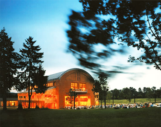
Seiji Ozawa Hall at Tanglewood, Lenox, Massachusetts

William Rawn Associates, Architects, Inc.
L. Lawrence Kirkegaard Associates, Acousticians

Build a room for music—a simple request that had a simple solution but required a complicated journey to deliver. The outcome of this design project was a space created specifically for the enjoyment of music, but it evolved into much more. It became a room with a view, from inside to out, from outside to in; it became an experience of joy, a labor of love to complete, and a lasting legacy for the Boston Symphony Orchestra. The hall was named in honor of Seiji Ozawa, music director of the Boston Symphony Orchestra from 1973 to 2002. The post-occupancy evaluation of this project is a testimony to the success of team problem-solving. The measurable outcome is the facility’s outstanding reputation and overall fame, which is evidenced, beyond its playbill of music greats, by its demonstrated value to patrons, students, and performers.

seiji-2

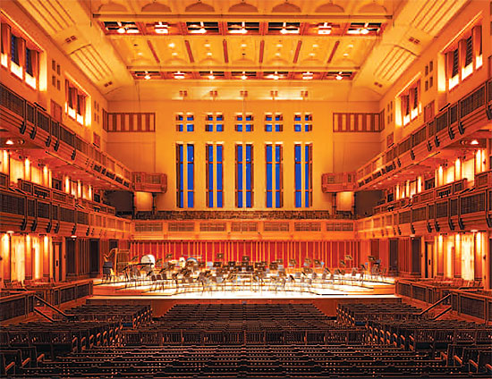
In 1989, when the Boston Symphony Orchestra Trustees Building Committee selected architect William Rawn to design their new summer concert hall at Tanglewood Music Center, they put a great deal of faith in a young architect who exhibited the sensitivity and resolve to work with the client in achieving a noble goal. The committee’s dream was to create, in Rawn’s words, “a room for music” in the tradition of other great performance spaces, with an acoustical excellence that would create a community of sound between the orchestra and an audience of 1,200.

The project was sited in the rolling hills of the former Highwood estate in Lenox, Massachusetts, site of the Tanglewood Music Center. Home to the Berkshire Symphonic Festival since the early 1930s, Tanglewood was a complex of studios, lecture halls, a library, and an amphitheater. The new concert hall would replace an old theater-concert hall completed in 1941, which had fallen into disrepair. The vision for the new facility entailed a sympathetic structure nestled into the hilly landscape that could accommodate a lawn audience and take advantage of the area’s natural beauty.

Rawn spent most of the first five weeks of the project absorbing the character and ambience of Tanglewood and getting to know the students, orchestra, and management. His team talked with key figures from the BSO Board of Trustees, Tanglewood’s administration, maestros, and musicians and sat in on rehearsals and concerts. Rawn found a “place of remarkable New England self-restraint” and was struck by the intensity of the students’ musical experience. He also spent time researching more than ten of the most important performance halls from the 19th century, including Amsterdam’s Concertgebouw and Vienna’s Musikvereinssaal. Rawn toured, measured, and sketched these facilities with acoustician Lawrence Kirkegaard. Although the architect’s primary interest lay in the spatial quality of the halls, he was observant of their acoustical solutions as well.

seiji-3

The solution Rawn proposed for Tanglewood was based on the concept of a New England meeting house: the hall would not be an auditorium, but more of a gathering space where the performers and audience could celebrate the community of live music. The audience would sit on three sides, with a big opening at the rear of the shoebox-shaped building. The lawn sloping away from this opening could accommodate hundreds more listeners.

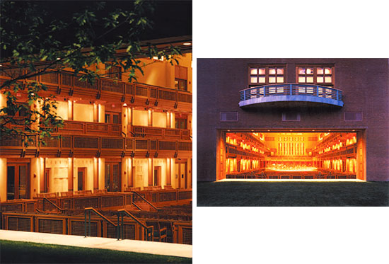
The architecture of the building derives its form and materials not only from the local vernacular, but also from the acoustical requirements of such a space. The rectangular plan, the equivalent of a triple cube in volume, was a tried-and-true solution used in many of the successful concert halls Rawn had visited. The building is made up of an outer brick and block shell, which holds the sound and resonates to the low-frequency bass response, and an interior of timber and other wood elements; the platforms, balconies, and arcades are constructed of fir, cedar, teak, and reused heavy timbers. The arrangement of the arcades and the grid motif of the interior balcony railings and panels give the space a sense of human scale and create the reflection necessary for acoustical clarity. Depth and articulation were key factors in the design of the ceiling as well.

seiji-6

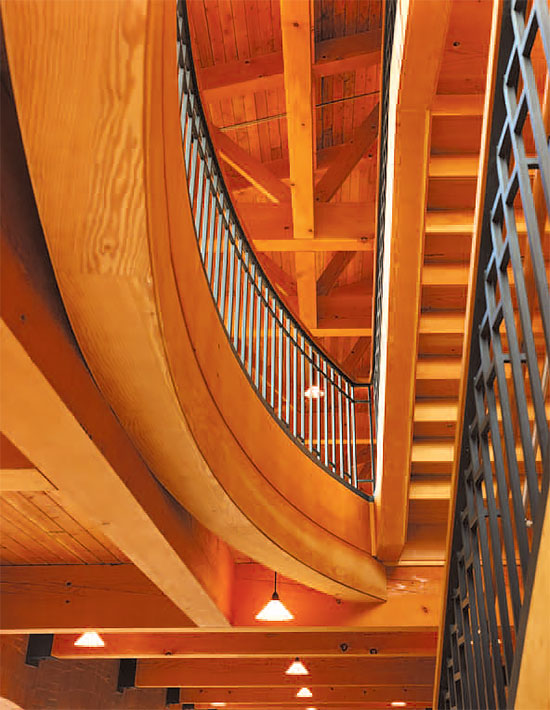
The collaboration of architect and acoustician has earned Ozawa Hall a rating as one of the top four concert halls in the United States and one of the top six halls built in the 20th century. It is ranked in the top thirteen concert halls in the world. This ranking is based on interviews and questionnaires with conductors, music critics, and concert aficionados. Robert Campbell of the Boston Globe reported that Rawn and Kirkegaard developed a “give-and-take working relationship in which each seemed to optimize the other’s goals.” The structure incorporates the massive walls required of a concert hall, yet suggests a remarkable lightness of structure. The wood grilles of the interior, necessary to blend and disperse sound, are designed as handsome architectural details such as coffers, bays, and crenellations.

seiji-5

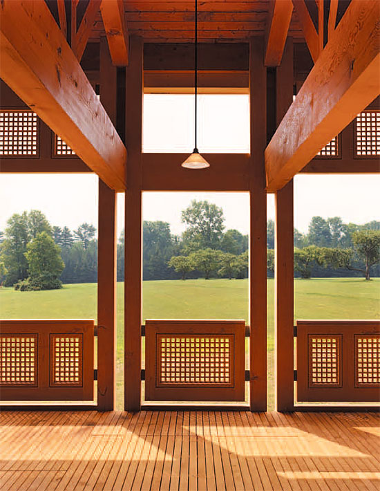
According to Peter A. Brooks, chairman of the BSO Board of Trustees, Ozawa Hall is known as a “warm, inviting place that captures the democratic spirit of New England.” The facility celebrated its 10th anniversary in 2004; over the first decade, its concerts became so popular that the concert hall enjoys an at-capacity audience for the entire season. The hall continues to accommodate the inventiveness of the Berkshire Music Festival and has housed dance performances as well. Patrons congregate in the arcades during intermission, taking advantage of the warm summer evenings and soft breezes. From almost any seat, inside or out, attendees can see sky, green trees, and lawn. The human qualities of intimacy and intensity in the “room” are part of the successful concert experience. Best of all, Ozawa Hall has been home to world-class musicians and performers and continues to inspire the Tanglewood Music Center students with the intensity and excellence of spirit and place that it provides.

seiji-4

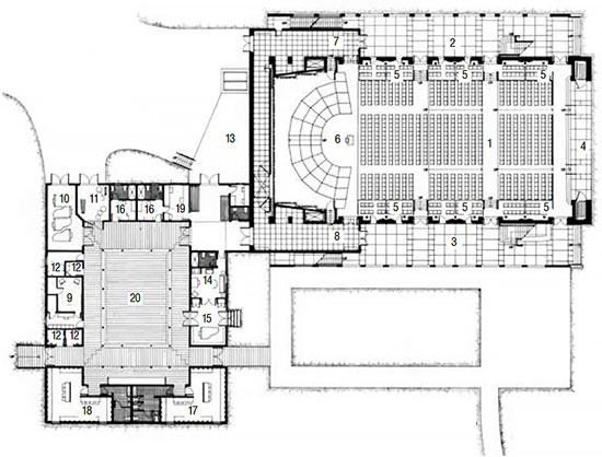
  1. Auditorium main floor
  2. Foyer, right
  3. Foyer, left
  4. Portal
  5. Loge boxes
  6. Concert platform
  7. Platform wing, right
  8. Platform wing, left
  9. TMC sound booth and recording suite
  10. Piano storage
  11. Percussion storage
  12. Practice room
  13. Loading dock
  14. Conductor’s dressing room
  15. Green room/recording booth
  16. Guest soloists’ dressing room
  17. Musicians’ changing room, female
  18. Musicians’ changing room, male
  19. Music library and orchestra manager office
  20. Open court/arcade/orchestra green room

[Note: This article first appeared in Significant Interiors: Interior Architecture Knowledge Community, published May, 2008 by Images Publishing and edited by Melina Deliyannis. Reprinted with permission.]

State of Indiana Health Care Clinic: Mission Impossible

ReceptionLowRes_16Feb15

Mission:  Design, Build and outfit an 8,400 square foot medical clinic in only 14 ½ weeks.

Agents:  Brenner Design, Keystone Construction and IU Health.

Location:  State of Indiana Government Center, Lower Level.

The project vendor, IU Health and its design-build team were selected early in 2014 by the Indiana Department of Administration (IDOA) as the providers for the new employee health clinic. After contract negotiation and proper approvals, Brenner Design and Keystone Construction (DB Team) were released in late February to complete their work. 

The challenge: the clinic must be ready no later than June 1 for the official open date and ribbon-cutting. This meant only three months to design, construct and fit-out the space. The task seemed virtually impossible!

The Client, IU Health, pledged their support in quick decision-making and approvals. IDOA representatives did the same.   The DB Team immediately dove into the logistics of how to attack this fast-track project. Together the team prioritized the release of plans and specs for ordering of long lead items. While Brenner completed the plan layouts, Keystone began to line up subcontractors and get pricing. As the plans were finalized, construction documents were filed for permits on an expedited schedule.  Meanwhile Keystone started demolition and ordered materials.

Brenner Design also needed to select the finishes and create the aesthetics of the space. The look needed to reflect IU standards as well as the new identity of the State of Indiana health care clinic. Keystone coordinated completion of casework shop drawings, while Brenner Design was completing the final laminate selections.

Brenner Design was also charged with procurement of all of the furniture, fixtures and equipment (FF&E). Brenner’s procurement team began to prepare costs, specify, order and track all components for a June 1 opening date. That meant that items needed to be delivered and installed while the construction was being completed.

PatientRoomLowRes_16Feb15

As the opening date neared, both the final construction work and the installation of FF&E were carefully coordinated. The DB Team subs worked overtime to complete final painting, casework and punchlist. Finishing touches including signage, art, chart holders and medical equipment were installed at the last minute.

This was the first fast-track project completed for the State of Indiana and both the Client and IDOA were very impressed by the DB Team’s commitment and follow-through. The project wouldn’t have met the schedule without the collaboration of an understanding Client and an experienced team. None of us thought that we could be ready for a June 1 opening, but we made it happen!

“Your staff helped navigate the hurdles of working with a large-scale organization, and also kept the State’s stakeholders happy.  The new clinic functions extremely well, not to mention that it looks fantastic! We get compliments daily. You made my life easier! ” – Lori McBride, Director On-Site Services, Indiana University Health Workplace Services

The National Bank of Indianapolis Lounge Design Showcased

nbi-chairs

Finding great solutions to problematic situations is one of our favorite challenges at Brenner Design. So when we were asked by The National Bank of Indianapolis to come up with a great solution for their employee lounge, we immediately turned to IDEON and SitOnIt Seating for help.

Because the structure of the room presented a challenge, we knew that seating needed to be flexible, functional and of a more fluid nature. The whole concept of an employee lounge is to provide a little oasis in the middle of the work day where employees can socialize (or find quiet time) and reenergize. Providing seating that allows and encourages those activities is key.

The room structure wasn’t the only challenge. Creating that “oasis” feeling is especially difficult in a lower-level space without windows. So we brought the sunshine in, so to speak, by incorporating vibrant colors and other visually exciting elements that would attract NBI employees to want to soak up a few minutes of relaxation and rejuvenation in that space.

We couldn’t have been more pleased with the finished result, and NBI reports that its employees are equally enthusiastic about the renovated space. So when The National Bank of Indianapolis employee lounge was chosen as a Project Spotlight by SitOnIt Seating and IDEON, well, we were honored and delighted.

Read more about the The National Bank of Indianapolis project, featured in SitOnIt Seating’s July 2015 newsletter.

Which Craft? Craft Restaurant, New York City

craft-1

Craft Restaurant, New York City, New York

Bentel & Bentel, Architects/Planners, LLP

Culinary craftsmanship is the chef’s ability to portray cooking as a craft, rather than an art. According to the design team the restaurant’s purpose is to “explore the full flavor of each artisanally raised ingredient on the seasonal menu, and serve these unadorned creations on separate plates placed at the center of each table for all to share.” Craft Restaurant not only celebrates special food and service, it showcases the process of design and the craft of the laborers who are responsible for creating this texture-rich and spatially impressive interior. So how can you determine which craft is which? Where does one craft end and the other begin? The project is an exploration of the ingredients, the contrasts, and the spice. The restaurant draws on the patron’s appreciation of the space, the food, and the atmosphere created by the union of the many crafts needed to accomplish a common goal.

craft-4

This intimate restaurant was conceived from the gutted wreck of a department store built in 1886 in central Manhattan. The 130-seat restaurant and bar of 5,425 square feet includes a 2,200-square-foot kitchen and a 3,500-bottle wine storage area. The entire operation occupies the first floor and cellar. The chef’s simple approach to food inspired the architect to experiment with a limited set of finish materials and to employ straightforward, high-quality craftsmanship to join them.

Five distinct elements define the restaurant space: a highly customized steel and bronze wine vault, a curved walnut and leather upholstered paneled wall, a space-expanding mural triptych, terracotta-clad columns preserved from the original space, and amber-hued bare-bulb lighting elements. The long (80-foot), narrow space has a 14-foot-high ceiling clad with wood-fiber ceiling panels. The room is spatially compressed and then released by the juxtaposition of the curved, paneled wall against the mezzanine-height wine vault. Each old and new building element exhibits a connection between its form and its structure and, at the same time, easily relates the scale of the room overall to that of the human body. The result is a comforting and comfortable space.

craft-2

Each element in the interior was carefully designed and executed. In particular, the custom-created wine vault is a collaboration between designer and craftsperson. Its design required a high level of detailing, combining wire mesh, steel plates, and bronze bars. The bar top is slightly oxidized steel that has been waxed: its patina is from use in the ironmonger’s studio, where the wine wall and bar were built.

The leather-paneled wall is made of vegetable-tanned calf leather normally used as a bookbinding material. The designers chose this type of leather for its tactile qualities—it was crafted to be held in the hand. The leather was carefully seamed and stitched to create a sculptural relief of form and pattern, and the resulting wall curves along its length and slopes inward at the ceiling. Even the simple fasteners, washers, and screws holding the leather panels in place were installed with skill and care. To understand the fabrication issues posed by their design, the architect made full-scale mock-ups of the panels and experimented with them in the office. The resulting wall provides a warm, rich backdrop along one edge of the room.

craft-3

The “temperature” of materials was also considered by the architect. The cool steel and bronze of the wine rack contrast with the warm feel of the leather panels. Even the perceived heat from the bare filament light bulbs contrasts with the cold clay columns. All of the furnishings and fittings, including the cherry dining tables and bronze bathroom sinks and hardware, were designed by the architect to further refine the character of the restaurant. Using only beeswax to protect the natural materials, the designers intended for the furnishings and fittings to gain patina and age gracefully.

The design solution combines such elements as space, form, color, materials, and textures to create a three-dimensional composition that reflects the soul of the client’s enterprise. The success of the final design is a result of the careful collaboration of the architect, chef, artist, and craftspeople who engaged in a compelling process that resulted in an enduring and artful work of architecture.

craft-5

  1. Entry vestibule
  2. Coats
  3. Front dining
  4. Bar
  5. Bar dining
  6. Rear dining
  7. Waiter’s station
  8. Restroom
  9. Stairs to kitchen
  10. Stairs to upper wine rack

[Note: This article first appeared in Significant Interiors: Interior Architecture Knowledge Community, published May, 2008 by Images Publishing and edited by Melina Deliyannis. Reprinted with permission.]

Oasis – Lutèce

oasis-1

Lutèce, Las Vegas, Nevada

Morphosis

A serene respite from the visually and audibly cacophonous interior of the Venetian Casino, Lutèce is a quiet, calm oasis in the Las Vegas casino environment. Building on the reputation of a successful sister establishment in New York City, the restaurant serves French cuisine in what is intended as a refuge for weary, hungry, and thirsty nomads in the gaming desert.

oasis-floor

The interior of the restaurant is visually interesting and restful. On entering, customers pass through a bronze portal etched with a conceptual plan of the restaurant—a hint of things to come. The floor is supported by a sculptural installation by artist Do-Ho Suh that is so subtle it almost appears as a texture on the floor. As explained by the architects: “Once inside, an army of tiny sculpted figures, with arms raised above their heads, supports the elliptical glass floor beneath the guest’s feet. The sculpture contains 19,000 human figures, equivalent to the entire population of the casino resort at a given point in time.” A massive wine wall is reflected in the curved glass walls of the main entry, creating the illusion of a space of much larger scale. The wine rack defines the curved perimeter of the bar area, and serves as a light trail directing customers into the main dining areas.

The architecture of the interior appears formed as if by centripetal force, orbiting the main dining room. The design was conceived as architecture of chance, with origins in the roulette wheel and bouncing ball, the most basic symbols of Las Vegas games. Morphosis describes the segments of curved wall as seeming “to spin about their off-center axis as irregular cutouts, which perforate the drum form and reveal views of adjacent spaces.”

oasis-2

Rather than creating visual confusion, the overlapping, connected spaces in the restaurant elicit a calm response. Perhaps it is the simple palette of color and materials that lends a sense of quiet. The space is a play on contrast: dark bronze bands against white drywall and smooth, curved, transparent walls against the jagged sculptural solids. According to Morphosis: “The geometry emanates from an abstraction of the classical formal dining room, finding its focal point in the massive chandelier above the main dining space.” The dining room is encased by a white, bronze-banded wall, in the form of a conical ellipse, which wraps the room and functions as the key organizational gesture, creating a sense of movement between areas. The same material evolves with a fluidity of form that mediates the transition into the remaining spaces. Encircling the main dining area is the reception area, bar, wine storage, patio, and private dining room. The feeling is almost one of a tent in the desert, with a sense that a sweeping wind surrounds it.

Only one small area is open to an outside terrace and seating area. The restaurant generally focuses inward, ignoring exterior views of the Venetian’s Grand Canal and ornate décor.

oasis-3

The restaurant’s lighting enhances the atmosphere of the space. With light sources cleverly hidden, the only identifiable fixture is that of the chandelier element, yet the lighting clearly distinguishes the abstract forms and walls, revealing the true texture and color of the materials.

The way a design is presented to a client or an awards jury can be as important as the design itself. Strong verbal communication and evocative drawings can give a client a preview of how users will perceive the final design. In the case of Lutèce, the visuals— two-dimensional graphics in plan and three-dimensional images in axonometric drawings—served the architect well in describing the proposed design intent. Simple parti diagrams and line drawings potently expressed the dynamic nature of the design solution. Like visions from a mirage, the architect created an illusion of the desired effect.

For an entry in a juried design competition, a minimalist approach and a presentation with visual strength are key. Strong visuals allow the team to document the design with fewer words. The architects who designed Lutèce used an unveiling montage to present beautiful drawings coupled with artfully composed photographs to tell the story of the project. The composition leads the eye from wide-angle views to miniscule details.

Lutèce presents itself as a contemporary interpretation of a classic culinary force. The architecture has taken an awkwardly shaped space and brought to it a sense of order, scale, and balance. The result is indeed an oasis from the intentionally insular, disquieting casino environment, and its design acts as both a foil and a reference to the frenetic air of chance and motion. The architect’s presentation of the project is as compelling as the final product; it allows the viewer to comprehend the concept and enjoy the journey.

[Note: This article first appeared in Significant Interiors: Interior Architecture Knowledge Community, published May, 2008 by Images Publishing and edited by Melina Deliyannis. Reprinted with permission.]