What's New

Not Just a Walk in the Park

Chicago_Riverwalk_27

Saturday in the park, I think it was the Fourth of July. People dancing, people laughing. A man selling ice cream, singing Italian songs. Can you dig it? Yes I can.

For those who don’t recognize them, those are lyrics from “Saturday in the Park” by the band Chicago. They seem especially appropriate when one contemplates the new Chicago Riverwalk, which is taking its place among the great urban amenities of our generation.

This recent redevelopment project along lower Wacker Drive in Chicago is an excellent example of a thoughtful and creative urban monument. If you haven’t had a chance to experience this new portion of downtown Chicago designed by Architect Carol Ross Barney, you need to make it part of your next trip there. The walk extends from Michigan Avenue west to Lake Street. Her design solves several functional problems, including flood control, a severe width restriction and ADA accessibility requirements in an elegant and sculptural way. The steps, ramp and walkways are inviting and human-scaled in contrast to the adjacent skyscrapers and provide a much-needed link to the wide expanse of the Chicago River.

Chicago_Riverwalk_32

Slow motion riders fly the colors of the day. A bronze man still can tell stories his own way.

The walk incorporates the Chicago Vietnam Veterans’ Memorial Plaza commemorating the sacrifices of Illinois’ fallen soldiers. Diverse opportunities appear as the walk winds its way through downtown Chicago. The public can experience unique dining options, areas for public events and waterfront amenities for human-powered watercraft.

The detailing is exceptional and the execution of the joints, edges and even expansion joints are done with precision. The integration of lighting slots and dots, drainage grilles and planters create a harmonious and beautiful urban park environment. The esplanade of the Riverwalk winds its way under bridges and follows the curve of the river. It provides an outdoor space in an otherwise frenetic city to be enjoyed mutually by joggers, walkers, strollers and the lunch crowd.  

People talking, really smiling. A man playing guitar, singing for us all. Will you help him change the world? Can you dig it? Yes I can.

In this case, it’s a “her” and not a “him” who changed the world. The Chicago Riverwalk design was conceived and detailed by female architect, Carol Ross Barney. While women represent only a small portion of the male-dominated profession of architecture, it is clear that talent is not limited to one gender. Our society in general normally accepts men as architects, but we don’t take the time to think about the opportunities or the benefits of working with women. To be a woman in this profession, let alone a practitioner, women have to be exceptional just to survive. So why wouldn’t a client want to work with a person who is an over-achiever, an American Institute of Architects’ Gold Medal Winner, one with a proven reputation for outstanding design? This project represents exactly why clients should. Female architects should be hired because of their experience, reputation and passion for making our built environment more beautiful.  

Take a look around and enjoy the experience!  It’s not just a normal walk in the park. Can you dig it? Yes you can.

Carol Ross Barney is founder and principal of Ross Barney Architects, Chicago, Illinois.

Photo credit: Kate Joyce Studios

Brenner Design announces an Employee

FOR IMMEDIATE RELEASE

Brenner announces a new Employee!

May 16, 2016

INDIANAPOLIS, Indiana –Brenner Design is pleased to announce that Bo Hancock has recently accepted the position of Business Development Coordinator.

Founded in 1992, Brenner Design focuses on award-winning architecture, interior design and construction management services. Project types include commercial, medical, banking, historic preservation and higher education. Hancock will be tasked with forming new and maintaining existing client relationships.

Hancock graduated with a B.A. in Business Management from Indiana University. He comes to Brenner Design following 3+ years of sales experience in Chicago. Born and raised in Indianapolis, Bo has come to be a sports fanatic, with a big love for the Colts and Pacers. His outside interests are heavily based in sports with weekly intramural teams along with competitive racing in triathlons. His energy and enthusiasm for the future of Indianapolis makes him an ideal addition to the Brenner Design team.

Bo Picture

Contact:

Bo Hancock

bhancock@brennerdesign.com

317-640-1389

A Gem for Our City. A Winner for Life.

150710_Catchings_557682153_Stars_Fever_Hoskins0324-72dpi

I recently attended the Legacy luncheon for Tamika Catchings, a personal friend. I was witness to an outpouring of accolades and well wishes for her final season as the leader of the WNBA Indiana Fever basketball team. The day was declared Tamika Catchings Day in Indianapolis by Mayor Joe Hogsett, and she accepted a Sagamore of the Wabash award from Governor Mike Pence.

Her well-wishers included sports greats, coaches and players, government officials, family and friends.

logo_mainI have to say that it’s about time. Tamika has been quietly doing amazing work for our community outside her professional career for over 15 years. Although she is known for her tenacious athleticism on the basketball court, many people do not know her work with Catch the Stars Foundation (CTSF). Tamika founded CTSF in 2004 to empower youth to achieve their dreams through goal-setting programs that promote fitness, literacy, and mentoring. The foundation meets needs through a specific emphasis on supporting and assisting under-served and low-to-moderate income communities throughout Indianapolis.

Tamika has had a tremendous impact on so many lives in Indianapolis, instilling a sense of self worth and purpose to the children who attend her camp. She teaches life skills in addition to basketball skills for the game she loves.

I have wondered for a long time why we haven’t seen more of Tamika, why the City doesn’t embrace her the way we embrace men such as Peyton Manning and Reggie Miller. Is it the media not taking notice, or the fact that women’s professional basketball is still growing in popularity? Whatever the reason, media take note: 2016 is her legacy season. On May 29 she will embark on a 12-city Legacy Tour with the intent to establish a legacy of giving. She plans to expand the reach of CTSF into every WNBA market. Her goal is to raise $100,000 in support of this worthy cause.

I encourage everyone to spread the word about her goals and accomplishments — in sports and in life. Tamika has written two books: Dreams are for Catching, for children, and her newest release this year, Catch A Star: Shining through Adversity to Become a Champion, co-written with Ken Petersen. Tamika is number 24 out on the basketball court, and number one in my book — a great female athlete and the kind of person I hope we all grow up to be. She has excelled in her career and more importantly, she has excelled at giving back with grace and humility.

So let’s raise her up while she is here with us, let’s celebrate her legacy season for the Indiana Fever with more recognition and more appreciation. Let’s support her efforts, attend the games and learn what we can from her, wish her well, say thanks and propel her into the next chapter of her career.

Good luck Tamika, you are a “24”- karat role model.

STATS:

  • Three-time Olympic Gold Medal Winner
  • 2012 WBNA Finals MVP
  • Past President of the WNBA Players Association
  • Ten-time WNBA All-Star
  • 2011 WNBA MVP
  • Five-time WNBA Defensive Player of the Year
  • Recorded the first ever quintuple-double in WNBA history
  • WNBA Rookie of the Year
  • Four-time All-American College Player

Tamika Catchings 2016 Legacy Tour Schedule

  • Sunday, May 29 at Atlanta (3:00 p.m.)
  • Friday, June 3 at New York (7:30 p.m.)
  • Tuesday, June 14 at Minnesota (7:00 p.m.)
  • Friday, June 17 at San Antonio (7:00 p.m.)
  • Saturday, June 25 at Dallas (7:30 p.m.)
  • Wednesday, June 29 at Chicago (12:30 p.m.)
  • Wednesday, July 6 at Los Angeles (7:30 p.m.)
  • Friday, July 8 at Phoenix (7:00 p.m.)
  • Sunday, July 10 at Seattle (4:00 p.m.)
  • Saturday, August 27 at Indiana (7:00 p.m.)
  • Sunday, September 11 at Washington (4:00 p.m.)
  • Tuesday, September 13 at Connecticut (7:00 p.m.)

 * All times LOCAL. Dates may not coincide with Catchings’ final game in each city.

Note:  you can also support Tamika and CTSF at the Scholar Athlete Dinner on Thursday, May 12, 2016 at the Hyatt Regency Indianapolis.  For tickets, visit www.CatchTheStars.org

Photographs courtesy of Indiana Fever and Catch The Stars Foundation

Image Is Everything: Architecture + Art

 Gallery to Office Shot

The Arts Council of Indianapolis fosters meaningful engagement in the arts by nurturing a culture where artists and arts organizations thrive. In designing a new location for the Arts Council at 924 North Pennsylvania Avenue, Brenner Design considered not only the interior environment, but also the external image that their facility would project to the City of Indianapolis.

Located in the historic Metzger Building, the arts organization had three prime goals: to showcase works of local artists, to create a home for the administrative office staff, and to be a catalyst for improvement in the St. Joseph neighborhood.

IMG_0359

The proposed plan layout included a storefront gallery (Gallery 924), a central visitor entrance lobby and administrative offices. Brenner Design proposed using perforated vinyl on the office windows to allow views outward from the interior, yet shield the staff from passersby. (The vinyl is the type used to envelop city buses.) Their “big idea” was to use the vinyl to reproduce works of art as large-scale murals.   

The exterior facade lent itself perfectly to enhance the mural concept as a series of perfect “frames.” The three storefront window bays to the south became the gallery space (with clear views in), while the three bays to the north (the office space) became the canvas for a triptych of murals (with clear views out).

Lobby+Door Shot _Phsop

The sustainable design concept for the interior reused original brick walls, historic wood doors, wood columns and beamed ceilings to create a flexible envelope for the gallery. The office space was created by juxtaposition of curved walls accented by the bright colors and original works of art placed throughout the space. The view into the gallery at night is quite inviting and attractive. The overall project was awarded for excellence in design.   

Several artists have benefitted from the commissions as well as the recognition. The Arts Council puts out a call to artists for existing work through their Artist Opportunities e-newsletter. Out of a pool of around 20, one is selected and the murals are fabricated and installed. In 2016, 40 works were submitted. There have been four different artists selected for installations since 2010 including Rachel Steely, Wug Laku, Susan Hodgin and Jessica Springman.

IMG_0257

“I was thrilled when I found out I’d been selected to receive one of the Arts Council’s Window Mural commissions.  What an opportunity, to have my work viewed daily by hundreds of people for an entire year, 24/7 and get paid? And just as importantly for me, to be able to see my work on that scale.” – Wug Laku, 2011 Mud and Twigs, Branch Weaver and Stilled Stream

“The murals have been great for my professional art career in Central Indiana. Anyone who has been to Gallery 924 over the past two years has seen my art on the building. The murals make it easy to introduce myself as an artist.  …often the first question asked is ‘Where is your work displayed?’ and I can say ‘You know Gallery 924 over on Pennsylvania Street? Those are mine!’” – Jessica M. Springman 2014-2016 Revelation, Pristina, Singularity

Steely1

The full-height murals have impacted the neighborhood with unintended results. “The murals are a success on so many levels; talented local artists are acknowledged, compensated and utilized in a unique way on a grand scale. The Arts Council becomes a more visible entity in the city as well as in our immediate neighborhood,” said Lindsey Lord, Public Art and Artists Service Coordinator. Notably, the murals have become a backdrop for selfies, senior photos, engagement photos, even professionally-produced commercials. “It’s a quite interesting study in human behavior from our side of the windows…you’d think people would realize we can see through the vinyl,” says Lindsey.

“People who see the work in photographs, as well as on the street, are generally impressed by the scale of the work. They also appreciate that the images ‘go with’ the architecture of the building (‘as though it was planned’).” -Jessica Springman 

That’s what happens when art + architecture work together!

“Interview Process”  Panel Discussion

Tuesday,  March 15, 2016 from 5:30 PM – 7:30 PM

Local architect and entrepreneur, Diana M. H. Brenner, FAIA, President of  Brenner Design with 2 other panelists will be discussing the do’s and don’ts of the architectural interview process.  The program will be presented by the Young Architects Forum of the Indianapolis Chapter of the American Institute of Architects.

“Whether it’s how to make a good first impression or how to present your portfolio, this is your chance to ask those important questions you’ve always wondered about. We are excited to have a diverse panel including architects and hiring managers from various sizes and types of firms in Indianapolis.”

Panelists include:
Diana Brenner, FAIA, Brenner Design
Rosie Foulke, Browning Day Mullins Dierdorf
Bryan Strube, RATIO

*Special thank you to our event sponsor, LIGHTsource, for hosting!

LOCATION:
LIGHTsource Studio
200 S. Meridian St., Suite 200
Indianapolis, IN 46225

Aspire for a New Image

Aspire_Reception_Original

When it comes to workplace interiors, there are many reasons to update your image.

If you find that your company is no longer as stimulating or productive as it used to be, maybe it’s time to re-imagine your workplace. The real estate cost of your facility is the second highest overhead cost that a business incurs next to labor. Combining labor and real estate makes the planning and design of your work environment the most important series of decisions that you can undertake . . . so don’t skimp on the time or effort it takes to design your workplace environment. Your investment can make the difference between success and failure. Hire an experienced interior architect and plan carefully.

There can be many reasons for change.

1) Your company may have updated your work processes or procedures, but your physical space no longer supports the new mission. You may need new furniture or a rearrangement of existing furniture within your existing space. Adjacencies between and among departments can be critical. Workflow needs to be understood. Make sure your consultant understands how you work. You’ve heard of efficiency experts? That’s what a good interior architect does.

2) You company has made changes that affect your capacity and employee count, and that directly affects the amount of space you need (larger or smaller). You may need to relocate, expand or downsize. This is an excellent opportunity to redefine your look. Careful planning of the new workspace is more than selecting carpet and picking paint colors — it’s creating a three-dimensional space that includes light, texture color and furnishings.

Aspire_Workstations_Original

3) You may have recently integrated new technologies into the work environment, and the old furniture no longer supports or accommodates the equipment. Shrinking workstations allows for more common area in a workplace and creates ancillary spaces for collaboration, enhanced creativity and promotes out-of-the-box thinking.

4) You need to attract new clientele. As you update your branding, your physical space needs to reflect who you are and what you do. Image is everything, and your look should tell your story and reflect your values to your customers. Your space should be inviting, appealing and comfortable.

5) You need to recruit new talent and retain the talent you have. First impressions are important. Your environment should reflect the professionalism and culture of your organization. Tired, old finishes and materials don’t exactly project success. A well-designed workplace can improve employee morale and enhance productivity. Give them the workspace that they need to be successful in your organization.

6) You want to provide a green, healthy and sustainable environment for your employees. More and more employees are sensitive to the impact you have on our society. Use of renewable and recyclable materials tells your staff that you are committed to their health and welfare.

A typical interior lasts between 7-10 years, but only with good maintenance. If you haven’t updated in that timeframe, it’s probably time. Let’s take the example of Aspire CPA’s, LLC. After ten years, it was time for a new image.

When Aspire contacted Brenner Design ten years after BDI had designed their original space, they requested a change from a traditional design aesthetic to a more contemporary, cosmopolitan look that would appeal to a younger client base. Being CPAs they, of course, had a fixed budget in mind.

Aspire’s request for a new image was primarily motivated by reason #4 above — the desire to attract new clientele — but it was an excellent time to also address productivity and creating an environment where employees thrive. First, we carefully evaluated areas to be renovated in order minimize construction costs and maximize impact. The concept included changes to the color palette, floor and wall finishes, accent lighting and furniture. The reception desk was redesigned using new materials to create a light, airy feel. New pendant lighting and furniture in the lobby and conference room were selected to complete the look.

Aspire_Conf_Original

In order to accommodate additional employees, large, drab, out-of-date cubicles were replaced with more efficiently sized components that incorporated glass, metals and brightly colored fabric and finishes. The staff work area was redesigned to create an open collaborative space fostering interaction between the staff. New low height workstations allowed more light into the space.

“At Aspire CPAs, we often think in terms of the William Shakespeare metaphor that “All the world’s a stage,” says Aspire’s Thomas Comisso. “Our office is our stage in a sense . . . our “front stage” is how we visually present ourselves to and interface with our clients and prospects. And while the “back stage” isn’t quite as visible, it’s equally important because that’s where our staff spends the majority of their time. For good reason, we’ve always placed a very high emphasis on feeling good about our overall office surroundings.

“On two separate occasions within the past ten years, we’ve been very fortunate to have engaged Brenner Design to help us with a comprehensive “front and back stage” redesign of our entire office space,” Comisso continues. “Brenner has provided comprehensive A-Z style design, construction supervision and furniture procurement services that have made each makeover relatively easy and hassle free. The office makeovers have helped create a culture that keeps us feeling fresh and rejuvenated as a firm.”

Working together to achieve the desired effect while staying within the specified budget, we were able to help Aspire make an investment that will pay off for years to come — and that makes a CPA’s day!

Cupping Hands – First Presbyterian Church of Encino, California

first-presb-1

First Presbyterian Church of Encino, California

Abramson Teiger Architects

The cupping of hands in prayer—a simple gesture, an expression of faith, and a metaphor of form—was the inspiration for the physical changes to the First Presbyterian Church of Encino. Pastor J. Malcolm Laing was looking to renovate a 1950s church building in decline as a means of invigorating his congregation. The architect was looking for an uplifting, enlightened concept to create a sacred place, one that “was small enough for intimacy to remain, yet large enough for silence to echo.” What they produced together was indeed a miraculous transformation of spirit and place, one with positive, measurable outcomes for the congregation.

The goals for the renovation were to significantly improve the quality of illumination and to develop a form that would create a greater sense of closeness and reverie. The original church building, a typical 1954 A-frame structure, with a somber interior featuring tapered glulam columns of dark-stained wood.

first-presb-2

Before the transformation, the nave was a traditionally axial and hierarchical form in which congregants gathered in a dark space apart from the pastor and choir. The new design brought forward and lowered the floor of the chancel and reorganized the pews in the round, creating a more embracing and participatory space. “Members and visitors alike have expressed the joy of the inclusive setting,” according to Marilyn and Don Fetherolf, corporate secretary and finance officer of the church, respectively.

The entire ceiling was transformed into a sculptural volume, formed by offsetting two irregular, curved planes lit by a combination of natural and man-made light. The design team drew inspiration for these facing forms, which shelter the sanctuary, from early Christian depictions of the mother of Christ with her cupping hands. The two planes also hide the sources of light, which seem to pool in pockets, feathering out from the sides of the space. The coloration of the light is subtly different on each face, warmer on the south face than on the north. The effect of the natural light changes over time and is both fragile and powerful.

Light has long been used to shape religious spaces. Light filters through stained glass in medieval cathedrals and through controlled openings in small chapels such as Notre Dame du Haut in Ronchamps, France. According to Kenneth Chang, chair of the building committee, “the darkness [in the Encino church] was lifted with light from skylights filtering through canopies of cloud panels.” The exceptional use of light, form, and symbol creates an architecture that inspires worshipers.

The architect of the First Presbyterian renovation considered the use of light a key design element. “The dynamic and transformative character of natural light heightens the sense of the ecstatic, of being brought into the revelation of divine grace and religious wisdom. Light is shaped in three movements that take the worshiper along a procession. The first movement is at the narthex, the entrance to the house of God, which filters in from above; its source is not evident. There is a suggestion of a space beyond, yet the main sanctuary is seen only through glimpses. The second movement corresponds to the main worship space. The congregation is illuminated by large openings to the north, which fill the sanctuary with tender light representative of God’s love and charity. Sources from the south are low, creating a common horizon of more brilliant light illuminating the congregation, the community of man. The third movement is the most brilliant and the most varied. Only here does light flow directly down the curved surfaces that shape the sanctuary, finally illuminating the full form of the church.”

first-presb-3

Fourteen skylights, some hidden, along with incandescent theater fixtures in sheltered pockets and fluorescent cove lighting, strategically control the illumination. This configuration creates a symphony of light that is varied and continually changing. The effect leads the eye to the back of the chancel where an elongated cross rises above the altar.

The congregation hoped the renovation would help increase membership, particularly among young adults. This goal was accomplished in several ways. The design uses a white-on-white color palette that provides a contemporary backdrop for weddings. The church is open for weddings to both members of the congregation and to non-members. The latter group generated new members who returned for Sunday services because they liked the atmosphere of the church.

An increase in the attendance at weekly services is also the result of the intense spiritual nature of the space after the renovation. When people are in the sanctuary, their spirits are lifted; that alone keeps them coming back. Pastor Malcolm Laing states, “There has been a very noticeable return of visitors who are looking for a new congregation to join, resulting in a 20 percent increase in membership.”

It is the religious experience that elevates the architecture of the renovated building and differentiates it from its previous form. According to Pastor Laing, “The remodeling of our sanctuary accomplished exactly what we had asked … a space that was light, uplifting, and welcoming … a space that physically manifested worship as a celebration in which all participate with the Eucharist, Baptism, and the Cross as the central focus … a space that felt holy. As people now enter our sanctuary for the very first time, their mouths fall open in awe-struck appreciation. And, more importantly, they return again and again. The design, seating, acoustics, and multimedia capability have provided our worship with renewed enthusiasm, greater energy, and stronger unity—pastors and people feel part of all that is taking place with all their senses engaged in creative ways … the sanctuary says, ‘This is the Community of New Possibilities where awesome worship is an every-Sunday experience.’”

[Note: This article first appeared in Significant Interiors: Interior Architecture Knowledge Community, published May, 2008 by Images Publishing and edited by Melina Deliyannis. Reprinted with permission.]

Intelligent Design – Smith-Buonanno Hall

brown-univ-1

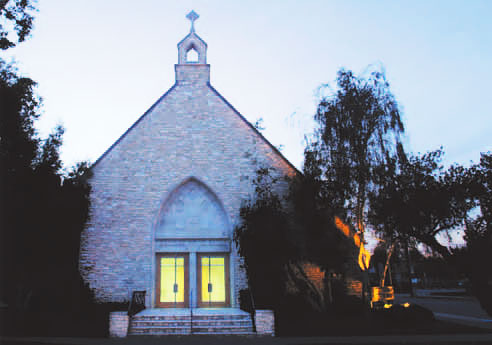
Smith-Buonanno Hall, Brown University, Providence, Rhode Island

William Kite Architects, Inc.

Is this building the product of environmental adaptation or evolution, or the intentional design of a talented architect? The Smith-Buonanno Hall project stretches the boundaries of pure historic renovation,exceeds the expectations of adaptive reuse, and leads to a new standard for interior classroom space. The design intent was to create a definite shift in how we perceive space and how institutions can enhance learning. Through thoughtful renovation, an endangered structure evolved into an energy-efficient, functional, and accessible building. The designers’ intent was to improve rather than replicate, to advance rather than imitate. The finished space is used for its intended purpose—as a classroom facility; more importantly, however, it inspires study and collegial collaboration. This project advances social and environmental goals by taking what was good from the old to construct a new, student-centered pedagogical environment.

brown-univ-5

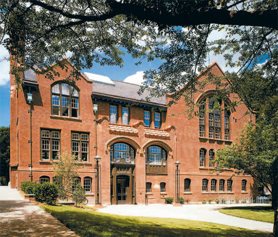
Originally built in 1907 as Sayles Gymnasium, Smith-Buonanno Hall was designed by Stone, Carpenter and Willson in a Gothic style reminiscent of universities in Britain. Willson, a protégé of McKim, Mead and White, created this distinguished structure in the image of the former Pembroke campus, now a part of Brown University. A noteworthy original building, it was a significant piece of the history of both institutions. Vincent J. Buonanno said, “It bespeaks the Anglophilic leanings of Brown’s patrons and leaders of a century ago and their understandable affection for some of the ancient English university campuses.”

brown-univ-2

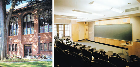
The project began as a restoration and in part as an adaptive reuse of the building. The exterior was meticulously restored reusing as much of the existing material as possible. Enough roof slates were salvaged to allow reuse on one whole side of the building, avoiding having to replace the entire roof with new material. New insulated-glass wood window sash was installed within the existing frames throughout the building to provide for a more energy-efficient exterior enclosure. Building entrances were redesigned to become fully accessible without the addition of exterior ramps or other obvious physical changes.

brown-univ-3

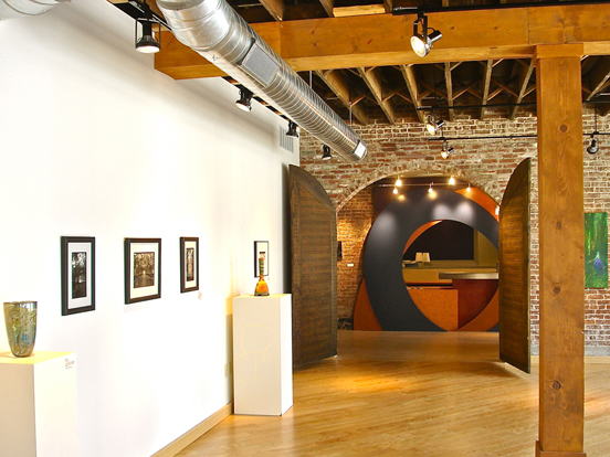
For the interior, the designers sought to maintain the atmosphere and quality of the original interior space, albeit for a completely new use. To this end, they studied new design elements that would contribute to and expand on the character of the building as conceived by the original architects. The prominent interior building space, with its distinctive wood trusses, brick walls, and wood floor, was respected in the new design. The existing woodwork, which on the surface appeared to be in poor condition, was found—after careful examination and the removal of layers of paint—to be quite sound.

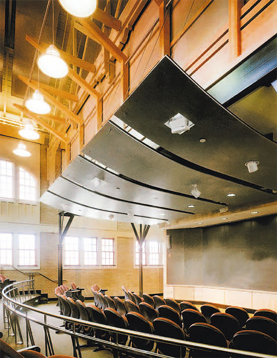
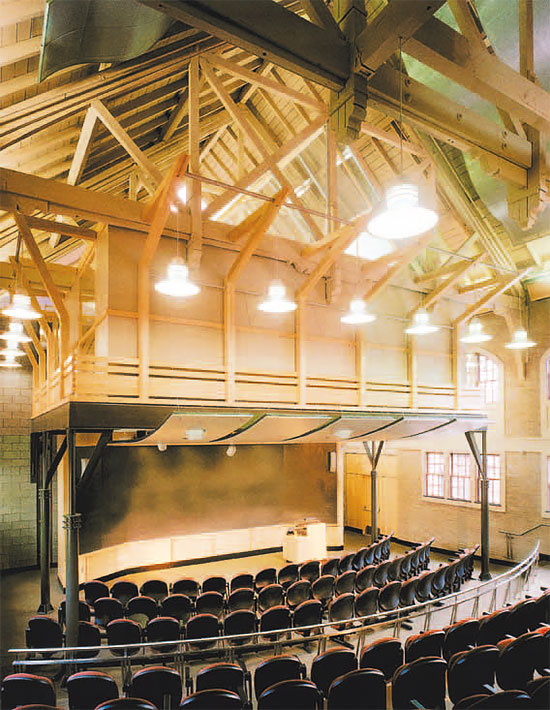
The most difficult task for the architect of the renovation was dealing with the client’s desire to create as many spaces as possible, while retaining a sense of openness and historical connection to the original architecture. The university wanted to insert a new floor level in the large gymnasium space to introduce additional program space. The architects believed that the quality of the space in an open arrangement would be more valuable to the university than the extra floor area gained by constructing a new level. The design team convinced the university to proceed with their proposed design through a rigorous presentation of how an open plan could meet the university’s programmatic needs. Once construction began and the administration could fully understand the design, university representatives became enthusiastic and excited by the design potential of the new spaces.

brown-univ-4

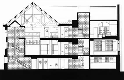
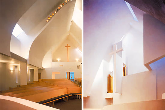
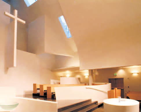
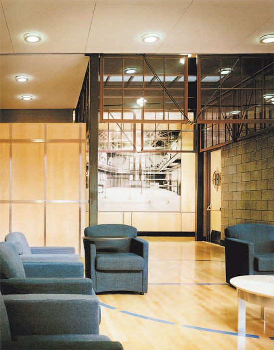
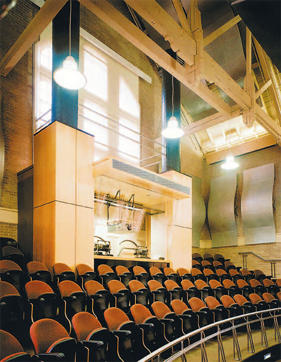
Within the two-story gym space, the designers placed new upperstory teaching spaces free of the exterior walls and ceiling. Supported by independent structures, the new spaces are designed to reveal the building’s original structure. The original wood trusses still appear intact in the interior space of the lecture hall and common room, and the new enclosures frame areas of the exposed trusses in scale with the new classrooms and seminar rooms. Glazed ceiling and wall panels help contain the new teaching spaces and provide acoustical privacy while allowing a transparent view into and through the building. The character of the original space remains intact and obvious from many vantage points and at different floor levels.

New visual relationships showcase the architectural components of the original space. Photographic wall murals, reproduced from historic prints, located throughout the building, illustrate what the space looked like in the early 1900s. The bridge, balconies, and canopy element over the audiovisual control room reflect the original mezzanine catwalk that encircled the building’s interior perimeter. For a touch of nostalgia, the foul lines of the original basketball court remain on the new floor of the two-story common room.

The design team made no attempt to replicate existing construction details. They intended to clearly contrast new and existing construction, allowing new and old to gracefully complement each other within the new environment. New construction details respect those of the original structure while expressing modernity in the use of materials, light, and color. New mechanical systems were integrated into the design and became visual elements, clearly expressing their purpose while providing energy-efficient heating and cooling to the new space. All lighting, light-control devices, sound systems, equipment, and computer-assisted teaching stations are fully integrated, state-of-the-art systems.

brown-univ-6

The renovated building has met with great favor among students, faculty, and the public. The most popular teaching space on campus, it is a highly sought-after venue for classes, meetings, and presentations. Shoggy Thierry Waryn of the Department of French Studies at Brown reports that “the success of the building among faculty is such that at the beginning of the semester, we all pray to have our classroom assignments in that building.” Senior lecturer Tori Smith reports: “I love the aerie that is Room 206, suspended over the old gymnasium floor, and I request it every semester for my Spanish language classes. The light pours in and we can look out into the trees and sky. My students love the space-age feel of the electronic controls, especially when they are activated by the professor in the room below ours and the blinds start to go down for what appears to us like no particular reason. We just laugh and pretend that we’re being readied for blast-off!”

The project has also set a new standard for interior classroom space at the university, becoming “the benchmark for excellence in all subsequent capital projects,” according to James Sisson, the university’s construction manager.

brown-univ-7

Although the building has every modern convenience and technical capability, this cherished piece of Brown and Pembroke history has been respectfully preserved for future generations of students and faculty, who will continue to appreciate it. Students can learn from the past while developing their future.

[Note: This article first appeared in Significant Interiors: Interior Architecture Knowledge Community, published May, 2008 by Images Publishing and edited by Melina Deliyannis. Reprinted with permission.]

Creating Executive Workstations: Function, Flexibility and Individuality

In today’s open, collaborative work environment, many executives find themselves in the midst of an open sea of cubicles. The question is, how can you differentiate workspaces or create a perceived hierarchy for executive or higher-level personnel?

Some issues to consider are size and location of executive workstations; a larger-sized cubicle might include a meeting table for conferencing or an island-style desk that invites staff to meet inside the cubicle. Views into and out of the cubicle should also be considered. A central location would appear to be most collaborative.

3_Knoll-NeoCon-2015-13-reff-profiles-meeting-table-interpole

A raised position could indicate a higher level of oversight. Using a unique footprint that is different from the standard cubicle or integrating curved panels in the cubicle could also make it more cutting-edge. Differentiation can also be achieved by using taller cubicle panels around executive stations.

Many manufacturers showcase flexible, movable work surfaces, panels and file pedestals. Using a work surface that is height-adjustable allows the person to choose to work in a standing or sitting position. Files with cushions create additional seating areas for impromptu meetings.

4_Knoll-NeoCon-2015-16-reff-profiles-height-adjustable-desk

There are many options for movable, adjustable task light fixtures as well.

Using electronic glass panels that change from clear to opaque can control the amount of privacy the person needs, or control the amount of visual connection to other staff. White boards, smart boards or writable glass partitions can also be integrated into the vertical surfaces of the cubicle panels.  

Upgraded finishes such as wood, metal or specialty finishes on the file fronts, cubicle panels or trim can give a unique feel to the workspace. A wood finish is generally perceived as more upgraded.

Colorful finishes on overhead doors and vibrant fabric patterns on tack boards can be used as accents in executive cubicles. Textured fabric panels on the exterior panel surfaces can be added to create an upscale look.

1_Knoll-NeoCon-2015-5-horsepower-remix

Acoustics should also be considered. Using white noise, sound-absorbent fabrics or even sound-bubble barriers can create the desired level of sound control for each station.

Integrating art pieces into the cubicle can also create an executive feel.  The overall design of the executive workstations should reflect the more personal taste of the person who occupies it, much like a mini executive office. Whatever the individual choices may be, the design should still “fit in” with the aesthetic of the overall office design.

Overall, the difference in level of design between the staff and executives should be subtle, not overdone. 

Photos courtesy of RJE Business Interiors and Knoll Furniture, Indianapolis

Local Architecture Firm Wins National Award

Indianapolis-based Architectural Firm was awarded American School and University’s Outstanding Design award for Work in Progress in their 2015 Architectural Portfolio. The new Ball State Football Complex in Muncie, Indiana is the first building designed by a female architect on the Ball State University Campus. The building is 13,556 Sq. Ft. and will connect to the existing Fisher Training Center. The new football complex is scheduled for completion in the spring of 2016.